Rethinking Social Media with AI

Agora Citizen Network · 2025 · 2 month project · Design Lead

The Problem

Agora is a EU-funded social media app that aims to solve the problems of computational propaganda and polarisation online.
This is part 2 of my work with Agora that ran over several weeks; I had initially run a 3 day design sprint with them to generate MVP propositions for testing. You can read about that here.

Onboarding

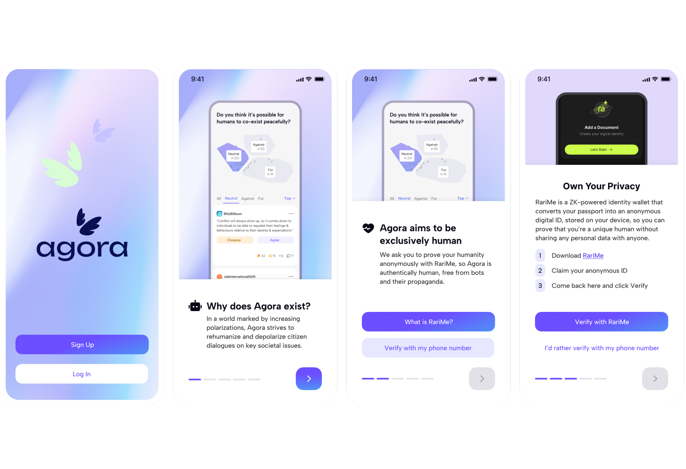
To solve computational propaganda, ultimately users would have to have their identity verified. Agora were working with a 3rd party called RariMe, which anonymously verifies your passport. We found that people were very reluctant to use this service, so we focused on educating users that RariMe or Agora wouldn’t store their data anywhere. We encouraged RariMe, but always ensured users could verify with their phone if they didn’t feel comfortable using it yet.

Prototyping the core UX

The core part of the product is called a wikiSurvey - A format of participation where users agree or disagree with opinions. This needed to be optimised for engagement. We explored different mechanisms for browsing and voting on opinions, from a tik tok type scroll to a more traditional list view. We decided on a stacked, infinitely scrollable list of cards for ease of use and scalability.

Where do you stand on current affairs?

The superpower of Agora is the analysis tab. After contributing opinions, agreeing and disagreeing with others, you can see a breakdown of the debate, where people are mostly agreed and what the dividing topics are. The schools of thought are labelled and summarised using an LLM.

I'm proud of this design. I believe interfaces like this are key to solving a lot of our societal issues. We need new tools that encourage healthy debate, not simply optimising for engagement.

User-lead moderation

For Agora to be truly democratic, it couldn’t be moderated by a centralised authority. We designed a system of moderation where users could flag posts, provide their reasons, and vote on those reasons. Posts would never be completely deleted, instead, if a post received multiple flags, it would be moved into a ‘Moderation History’ section, where it could be brought back into the discussion if enough people felt the flags were unjustified.

Design System

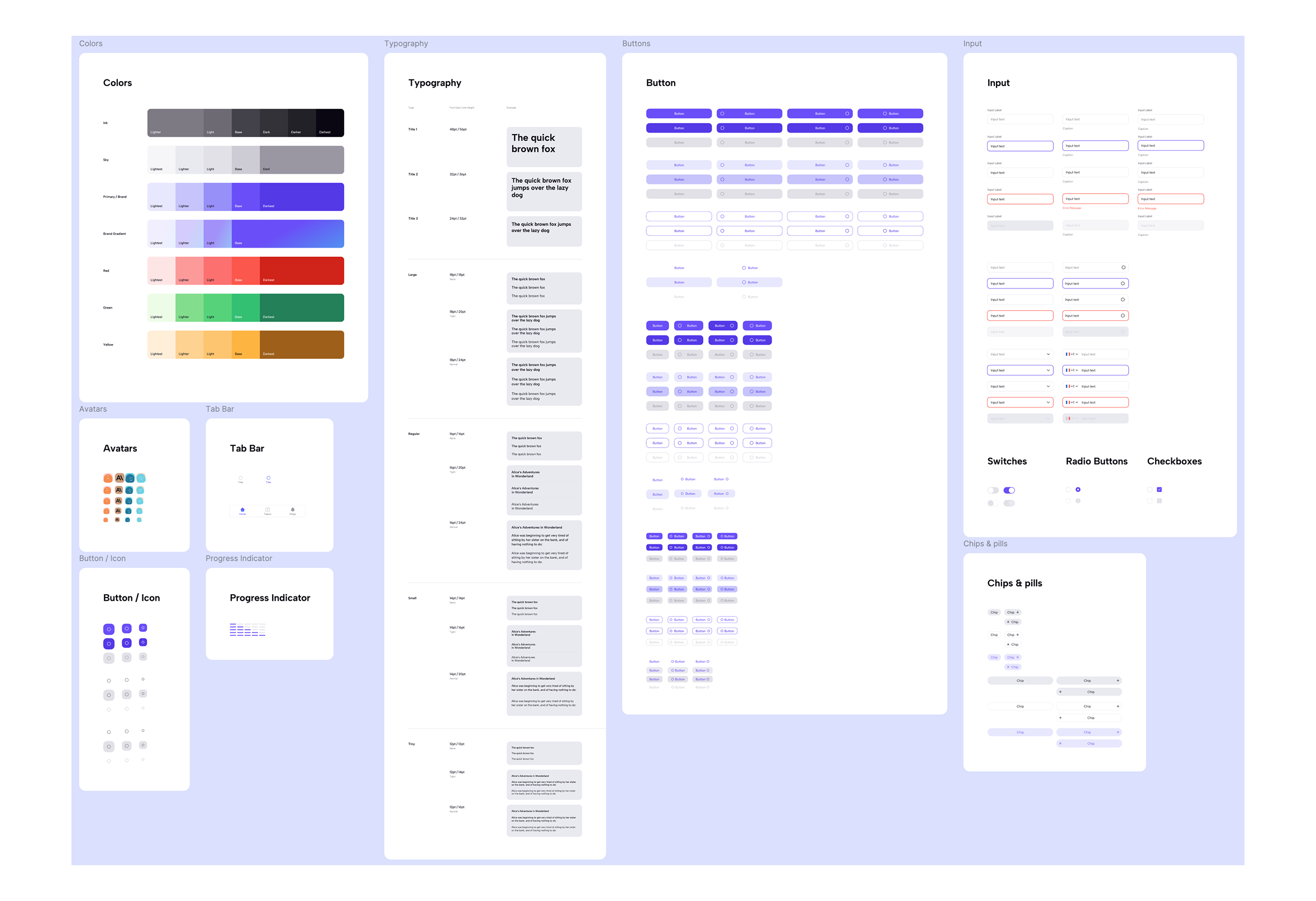
For dev handoff I created a comprehensive design system to ensure every component in the app was accurately reflected in build. The typography system was designed to be usable for all instances of text in the app. It featured 5 core text sizes ('Title', 'Large', 'Regular', 'Small', 'Tiny') with 3 line heights available for each ('None', 'Tight' and 'Normal'). By sticking to these tokens in the designs, the developers knew exactly what to build. The line heights were particularly useful for building components out, where you might want 100% line height to ensure the padding is correct.

Branded Elements

Through designing the interface we experimented with different colour and type schemes. The product positions itself as approachable, intelligent and warm. To reflect this in the brand we went with Albert Sans for the typeface for it's versatility, clean aesthetic, and readability. It's clean, geometric structure combined with humanist elements (such as soft curves) make it approachable yet professional.

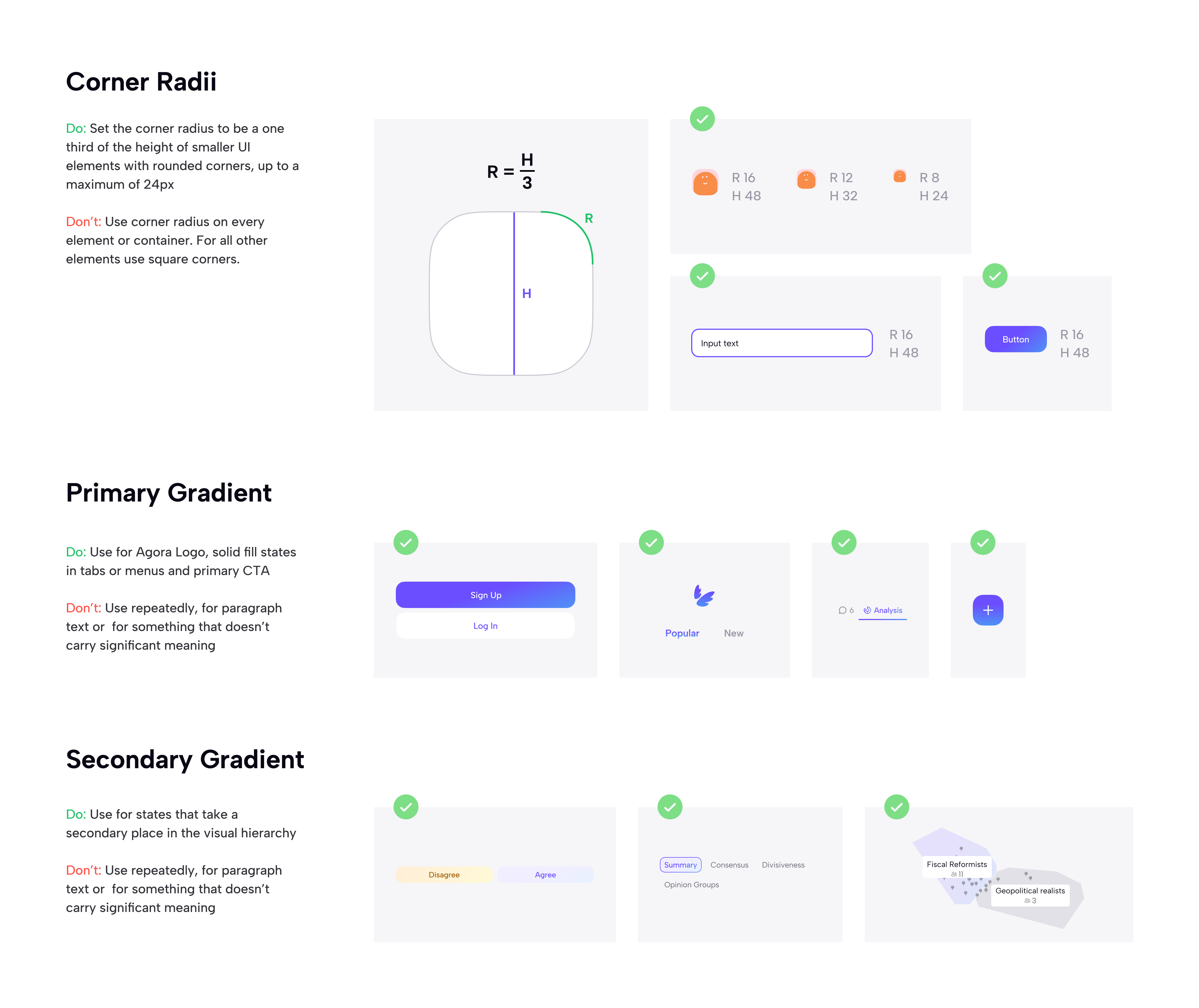
We also settled on a system of gradients and corner radii that ensure all the UI elements feel consistent. By making the corner radius a third of the component height, it creates a friendly, soft visual pattern running through the product.

Outcome & Reflection

Agora was an amazing opportunity to define a B2C product from the ground up. I particularly enjoyed positioning the brand, and creating a design system specifically for digital that reflected that brand. I'm hoping to continue working for Agora to help them develop their product and marketing site, which needs some love!